LOG 9 - Evolution of the tail effect
Hello for this week's post I'm going in depth about the evolution of the tail effect. From flat color that was released in the last prototype to what you see below.
 |  |
Bit of a difference (:
The tail effect is the most important element in the game to get right. The puzzles are completely dependent on what configuration the tail is in. So the visuals have to be readable. The player also needs to think about the solution, so the tail cannot distract from that. It also needs to fit in the color scheme. The tail needs to communicate when the puzzle is solved. But with all this in mind I want the tail to be pretty and if the player wants a break from thinking about solutions they can admire the tail. So in summary the tail effect needs to:
- Look good
- Be readable and not distracting
- Fit into the game's color scheme
- Fit the theme/plot of the game
Quite a lot of things to get right!
Iteration 1:
Playing around with unity shader graph, I quick realized that a static effect was not taking advantage of the power of shaders. Plus static effect looked odd as the circle moved through the puzzle. So I started experimenting with a moving "field" effect:
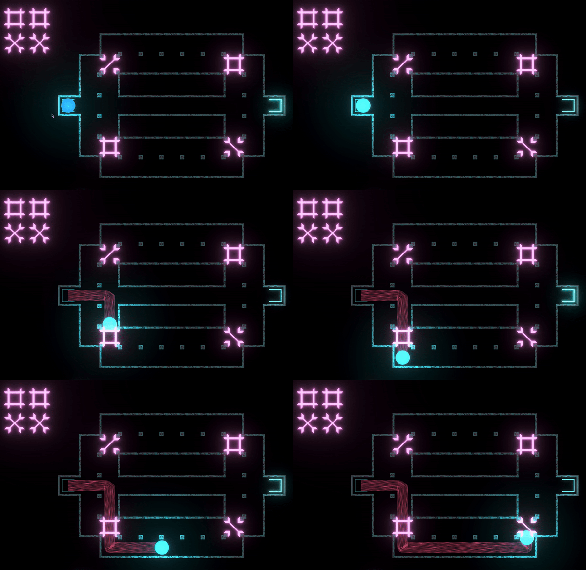
I thought it looked cool, but the feedback I got was, people liked the pink and blue neon look of the other parts of the puzzle but the tail was way too distracting and did not fit. I learnt the lesson that just because I can add an effect does not mean I should. Kind of like how zoom lenses were heavily overused in 70s cinema. Also thinking about the effect, it looked too flat. Kinda had an early 90s game look. So in iteration 2 I enhanced the color with a glow effect, slowed down the movement and to remove the flatness, added a gradient that faded in the middle of the line. I also stopping stretching the particles:
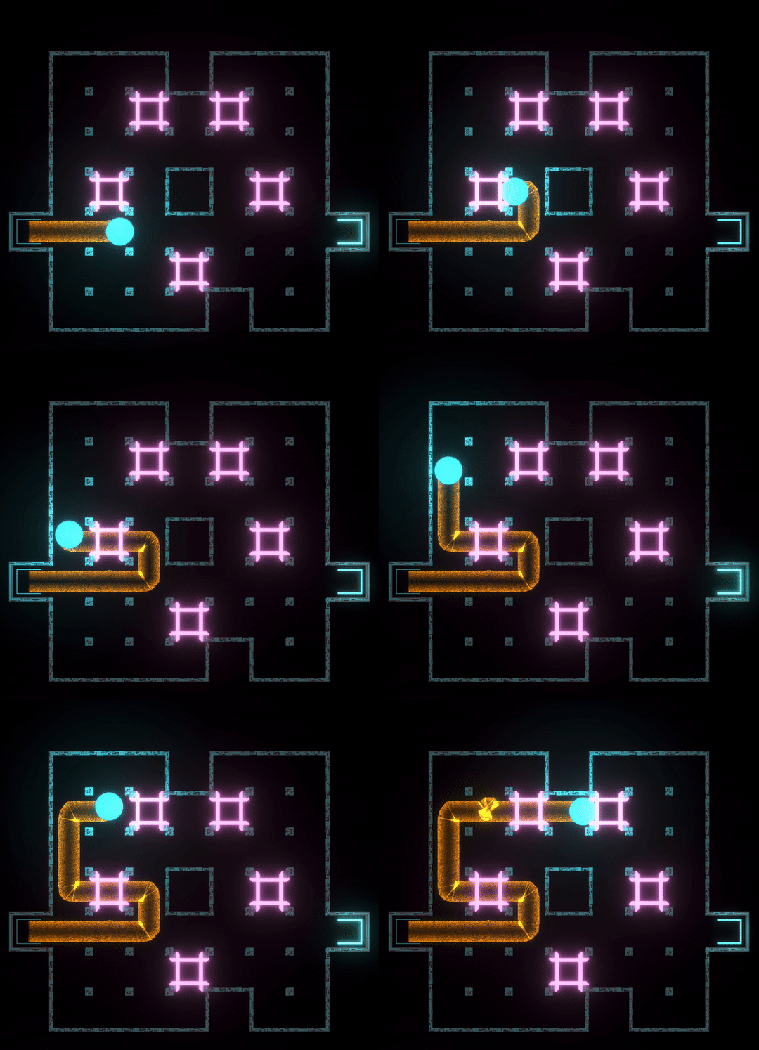
This was getting closer. The feedback was color did not match and was too distracting. Also the "pinches" in the corner needed to be fixed. But the slow speed of the particles was nice. I noticed an unintended side effect of gradient. It showed a path with negative space that the line was taking! Thinking about the color, I decided to just to match it with the circle. To fix the pinches I added extra interpolated points to the line renderer and removed transparency in the effect. I also felt it was still a little flat looking so I added a fade in and out along the line. Here is what I ended up with:
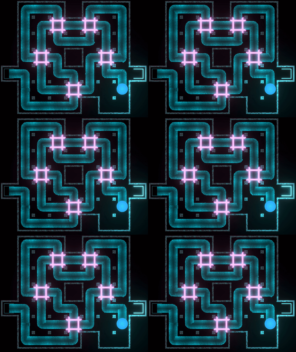
Finally something I was happy with! The feedback I got was it looked great!I like how it subtly flows through the puzzle, but is not distracting. But you can take the time to admire it. The dark center gradient helps with readability as it traces a line of negative space. The pinches have also been fixed and the flatness is mostly removed. There's still a rendering problem at the corner, but its good enough for now. With the tail in in a state I was happy with it is time to move to the tail in puzzle solve state
How the tail looks when the puzzle is solved
My first thought was keep it simple. I tried just changing the color. It look ok, but I thought I can do better. I tried speeding up the particle travel speed. But this produced a jarring effect when the speed stopped changing. I could add an acceleration curve to smooth it out. But again I though I could do better. I realized there is more freedom to use stronger VFX when the puzzle is solved as the player no longer needs to concentrate on the solution. They can now sit back and admire their work. I added a played around with adding vertical lines to the tail win state:
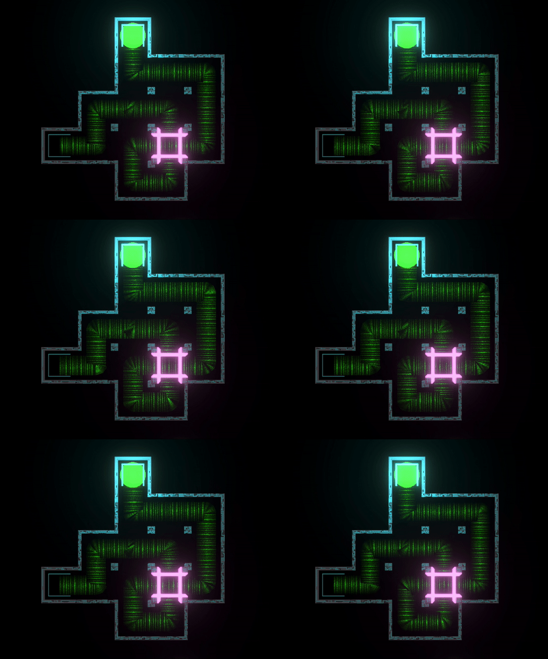
It looked ok, but had too much early 90s feel with the round bright center gradient. Color was also not right.
In a future version of the game the puzzle will act like switches and open up areas. So I'd like to have some sort of electricity effect for the win state. I played with this idea:
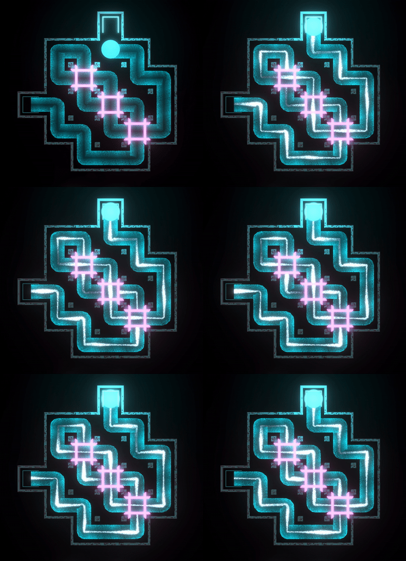
This looked ok and it informs gameplay by showing completed puzzles active something. But it just looked a bit too cartoonish for the theme I was going for. The next effect I tried was a electrical storm look. Like something you see on the surface of some fictional gas giant:
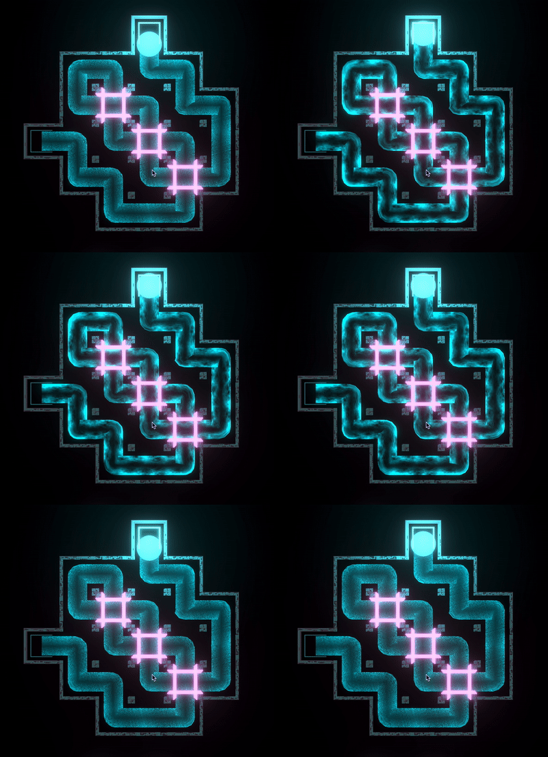
I was pretty happy with this. It defently gives the player a visual reward for solving the puzzle. I like how the clouds smoothly flows through the puzzle and the subtle changes in the glow effect along the line. The only thing I'm not happy with is that it does not communicate electricity. But that's something I can revisit at a later date.
Thats the tail effect journey so far, been a fun couple of weeks tinkering around with unity shader graph to achieve the above. There will be futher iterations on the tail. I'll keep you posted.
In a few days I'll have another build of the prototype with these enhanced VFX ready to download. In the meantime. Follow Trifoil development as I take it from a prototype to a professional level Indy game by following me on itch.io or twitter.
Get TRIFOIL
TRIFOIL
A puzzle game about drawing lines that cross, merge, and interact in unique ways.
| Status | In development |
| Author | andrew_jones |
| Genre | Puzzle, Adventure |
| Tags | 2D, Abstract, Casual, Exploration, linedrawing, Minimalist, Neon, Singleplayer |
| Languages | English |
More posts
- Demo 0.46.1 patch notes71 days ago
- Demo 0.46 patch notesJun 09, 2025
- Demo 0.45 patch notesJun 06, 2025
- Demo 0.44 patch notesJun 04, 2025
- Demo out now!May 28, 2025
- Demo release date is 28th May!May 25, 2025
- Itch.io page refreshMay 06, 2025
- Steam page is live - Wishlist now!Aug 03, 2024
- Rough edit of the reveal trailer on youtubeJul 24, 2024
- Pre-demo alpha build ready for play testingJun 30, 2024
Comments
Log in with itch.io to leave a comment.
It's looking impressive! I have to learn more about shaders myself... :)
Thanks, shader graph is really fun and an absolute time sink! The new version of Trifoil with upadate visual is out BTW! https://andrew-jones.itch.io/trifoil